
Walk down any aisle and it’s obvious: packaging is the brand’s first handshake. In seconds, shoppers decide what feels premium, trustworthy, or fun, often before they’ve read a single word. That’s where Custom Decoration Services come in. By pairing smart design with techniques like labeling, embossing, foil stamping, and screen printing, brands can elevate shelf appeal, signal quality, and make the right promises at a glance. And in competitive markets, those first impressions aren’t just nice to have: they’re conversion levers that drive recognition and repeat purchase.
The role of decoration in shaping consumer perceptions
First impressions drive fast decisions
On a crowded shelf, consumers skim. Visuals that read quickly, clean hierarchies, decisive color contrast, and a memorable icon or wordmark, earn the pause that leads to a pick-up. Decorative choices shape that snap judgment: a satin varnish reads refined, a bold spot color shouts “new,” and a softly textured label whispers “crafted.”
The psychology behind finishes
Decorative elements do more than look good. They cue meaning. A crisp emboss can imply engineering precision: a warm uncoated stock suggests natural, small-batch credibility. This is the halo effect at work, when the package looks and feels high-quality, the product inside is assumed to be high-quality too. Legibility matters as well: when typography is easy to parse, people perceive the brand as more honest and competent. It’s processing fluency, translated into trust.
Shelf appeal in competitive markets
In categories where products cluster at similar price points, small tactile upgrades can tilt the decision. A raised seal on a coffee bag, a foil glint on a skincare carton, a high-opacity screen-printed badge on a glass bottle, each creates a micro-moment of delight. Multiply that across a planogram, and custom decoration services become a silent salesperson, helping the brand win attention and signal value without adding a single word of copy.
Sustainability cues without shouting
Consumers scan for eco signals, but they also expect polish. Design can bridge that tension: uncoated papers with subtle debossing, minimalist ink coverage, or a QR code linking to recycling instructions. It’s not about slapping on a leaf icon: it’s about coherent materials and finishes that make a credible, modern statement.
Labeling techniques that boost visibility and compliance
Make the front panel work harder
Labels do double duty: they attract and they clarify. Smart systems reserve the front for fast reads, brand, variant, primary claim, while pushing dense details to the back or to an extended content label (ECL). Color-blocking, high-contrast type, and disciplined whitespace increase scan-ability from three to six feet, which is often the distance at which decisions begin.
Compliance without clutter
Food, beverage, cosmetics, and regulated products have non-negotiable requirements (think nutrition facts, INCI lists, allergens, warnings, net contents, and country of origin). Good decoration anticipates this early. Techniques include:
- Extended content labels (booklet or peel-back) for small containers that still need room for multilingual copy.
- Tamper-evident features integrated into the label architecture without obscuring branding.
- Clear hierarchy and minimum contrast for legibility: large claims shouldn’t drown out critical instructions.
While exact rules vary by market, aligning with recognized frameworks, like GS1 for barcodes and data structures, keeps packaging scannable across retail systems.
Barcodes, 2D codes
Today’s shopper expects a digital bridge. Beyond the UPC/EAN, brands increasingly use QR codes or DataMatrix to deliver deeper information, ingredients, sourcing, authenticity checks, or loyalty experiences. Variable data printing supports batch/lot codes and traceability programs, and serialization (where required) can be embedded without hijacking the design. When executed cleanly, that small square isn’t visual noise: it’s an on-ramp that says ” See details” exactly when curiosity peaks.
Accessibility is part of visibility
Readable type sizes, sufficient color contrast, and intuitive iconography aren’t just best practices, they broaden your addressable audience. On certain categories, tactile indicators or Braille may be specified by regulation: even when optional, they can demonstrate care and professionalism.
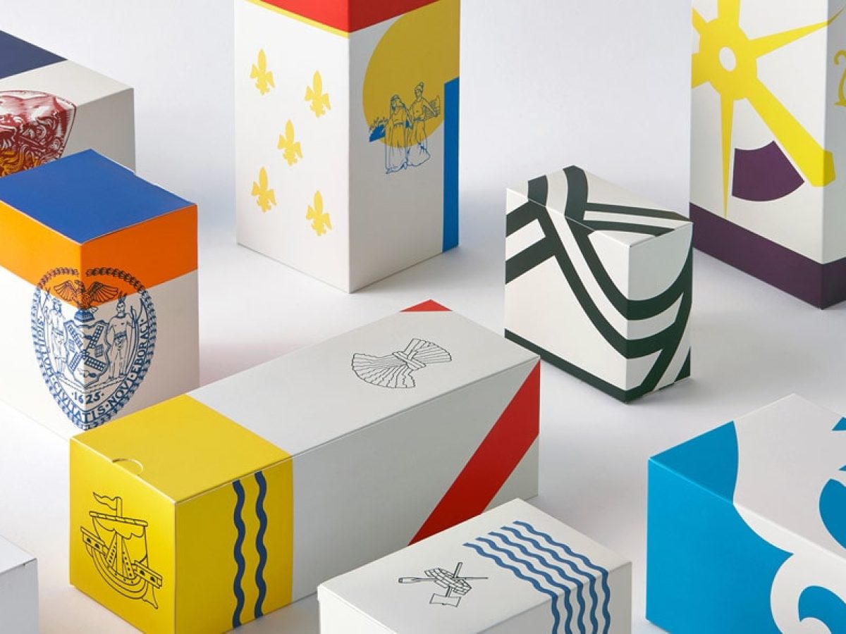
Embossing, foil stamping, and screen printing explained
Embossing (and debossing): shaping the substrate
Embossing raises the surface of paperboard or label stock using matched dies: debossing presses it inward. Both add shadow and tactility that cameras can’t fully capture but hands instantly feel. Use cases include logos, seals, signature patterns, or to add a crafted texture to otherwise simple layouts.
- Best for: paperboard cartons, premium pressure-sensitive labels.
- Considerations: added tooling, registration tolerance, and slight impact on lead time. Combine with foil or ink for sculpted effects, but avoid over-embossing thin stocks that can crack.
Foil stamping: light-catching accents
Hot foil stamping transfers metallic or pigmented foil with heat and pressure, creating that unmistakable glint. Cold foil, applied inline with adhesive, excels at fine detail and faster runs.
- Best for: premium cues (gold/silver), security accents (holographic patterns), and tone-on-tone pigment foils for subtlety.
- Considerations: coverage area affects cost: keep it where it counts, logos, product names, borders. Many paper recycling streams accept foil-decorated cartons because the metal layer is microscopically thin, but confirm with local guidance and avoid full-coverage metallic laminates when recyclability is a priority.
Screen printing: bold, durable deposits
Screen printing lays down a thicker ink film than most processes, producing rich opacity and tactile varnishes. On glass or rigid plastics, rotary screen can deliver crisp, wraparound graphics that shrug off moisture and abrasion.
- Best for: glass bottles, high-contrast spot colors on dark substrates, raised clear varnish for grip or pattern.
- Considerations: generally slower than flexo or offset: mind unit economics on long runs. Ask about UV-LED curing to reduce heat and energy use.
How to choose the right technique
- If the goal is premiumization with maximum impact per dollar: spotlight foil on small areas + a restrained emboss.
- If durability on non-porous surfaces matters: screen print key elements, then protect with a compatible varnish.
- If sustainability is central: prioritize uncoated or easily recyclable stocks, minimal foil, and vegetable- or water-based inks where feasible.
A capable custom decoration services partner will prototype combinations, foil-on-emboss, screen-on-foil, micro-pattern deboss, so teams can judge effect in hand, not just on screen.
Balancing creativity with functionality in design choices
Design for the real world (not just the mood board)
Glorious soft-touch coatings can smudge. Deep, rich blacks can scuff in transit. Metallic foils can create glare under retail lighting. The fix isn’t to play it safe, it’s to test. Shippack mockups, run abrasion tests, and review under varied color temperatures. If the package lives in a fridge case, condensation matters: if it rides in e-com mailers, edge crush matters.
Production constraints that shape decisions
- Print process: offset vs. flexo vs. digital impacts resolution, color gamut, and cost at different run sizes.
- Substrate: paperboard, film, glass, or plastic each carry different ink systems and finishing compatibilities.
- Line speed: can that delicate label apply cleanly at 300 units per minute? Rethink die-cuts or adhesives if not.
Cost, sustainability, and simplicity
Decorations add value, but also cost and complexity. Use a “hero plus restraint” mindset: elevate one or two elements (an embossed crest, a foil wordmark), and keep the rest minimal. Align with recyclability guidelines (for example, wash-off labels for PET, reduced metallization, or APR/CEFLEX best practices) so the package performs after use, too.
Measure what matters
Build simple KPIs: shelf stand-out (eye-tracking or intercepts), readability scores, damage rates in transit, and cost per incremental conversion. Creativity earns its keep when it moves one of those needles.